F&P
The website as knowledge bank for an entire industry
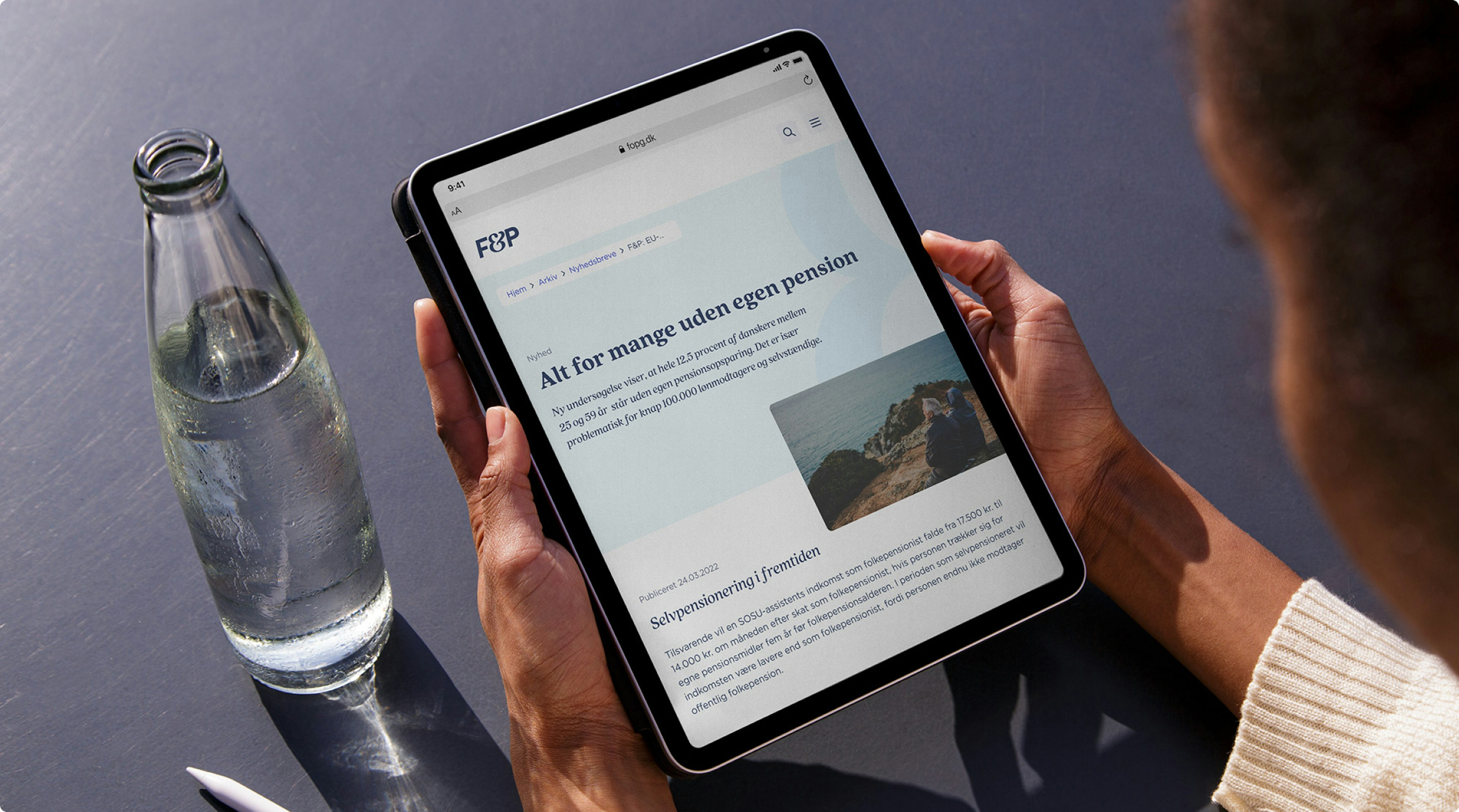
F&P is the industry association for insurance and pension in Denmark. The organisation looks after the industry's interests and works to communicate the industry's role in solving relevant social problems. Besides that, they have an important task of knowledge sharing between the members, which largely takes place on and around the website. Charlie Tango has designed the website, which presents the organisation's opinions and extensive knowledge, for both members and external stakeholders with an interest in the organisation.
fogp.dk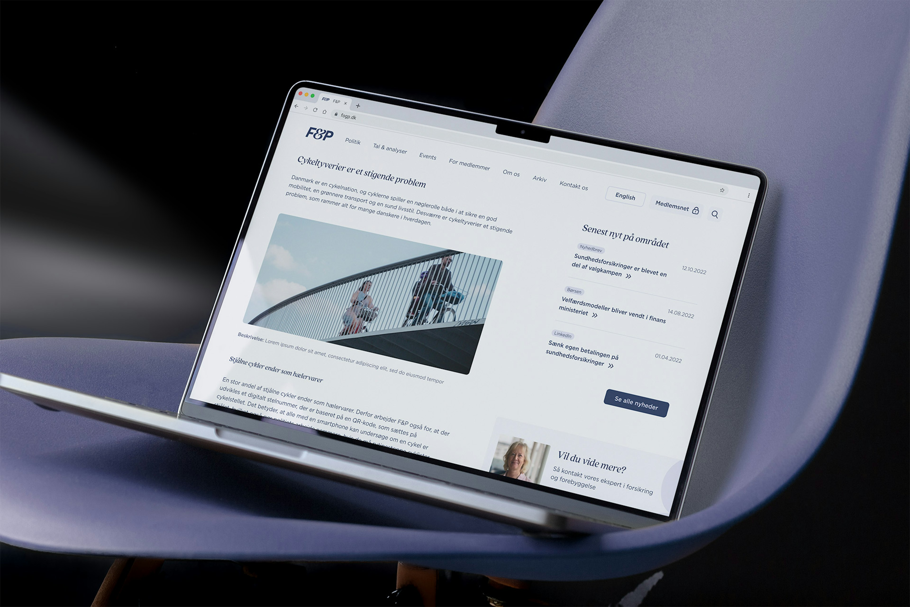
Opinions and knowledge in focus
F&P's website works as an information and knowledge bank for F&P's many communication channels and is structured around the various opinion- and knowledge areas. Each area is organised so that the various user groups have easy access to an overview of the subject, as well as the latest knowledge in the area and dialogue with F&P's knowledge workers.

Accessible and welcoming
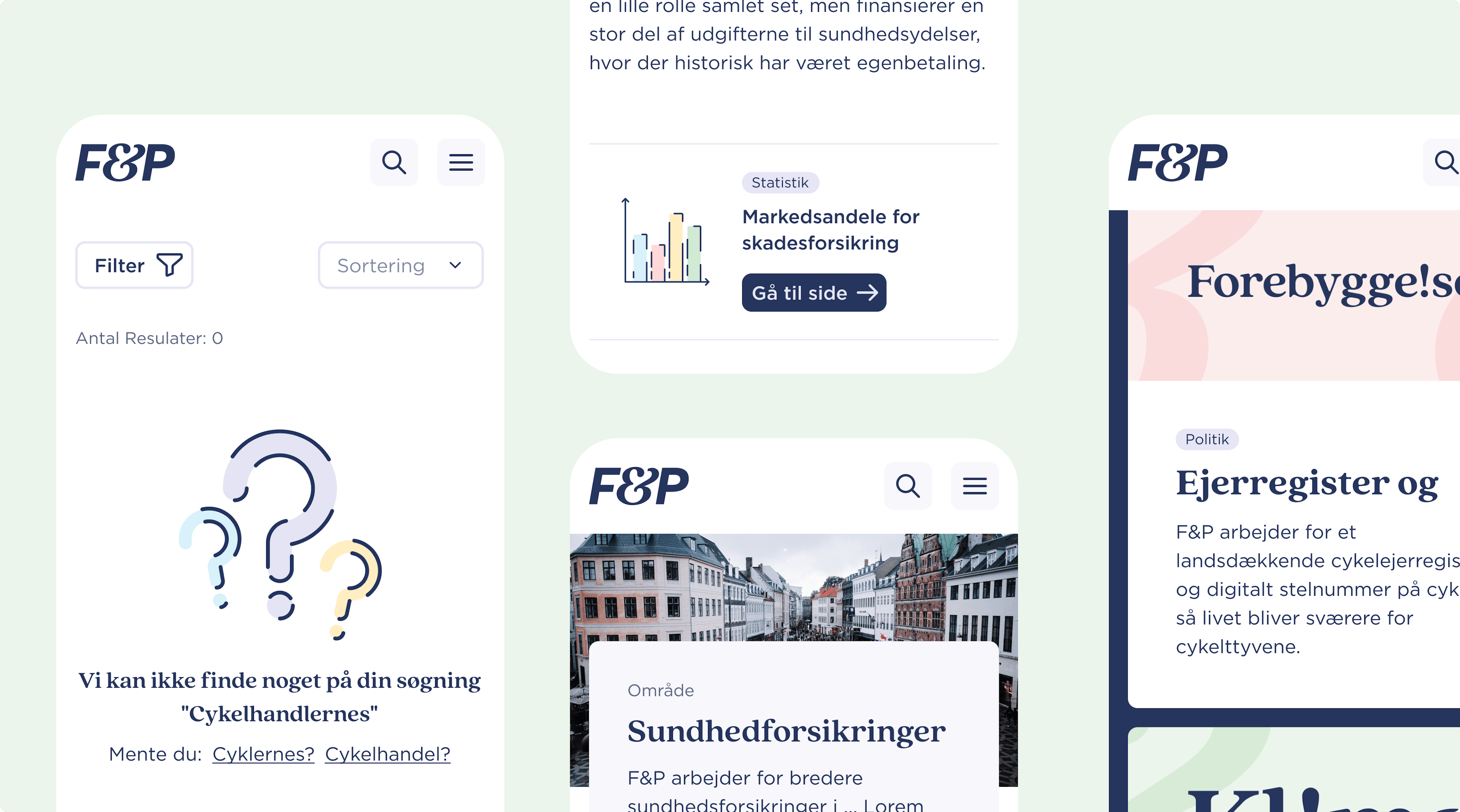
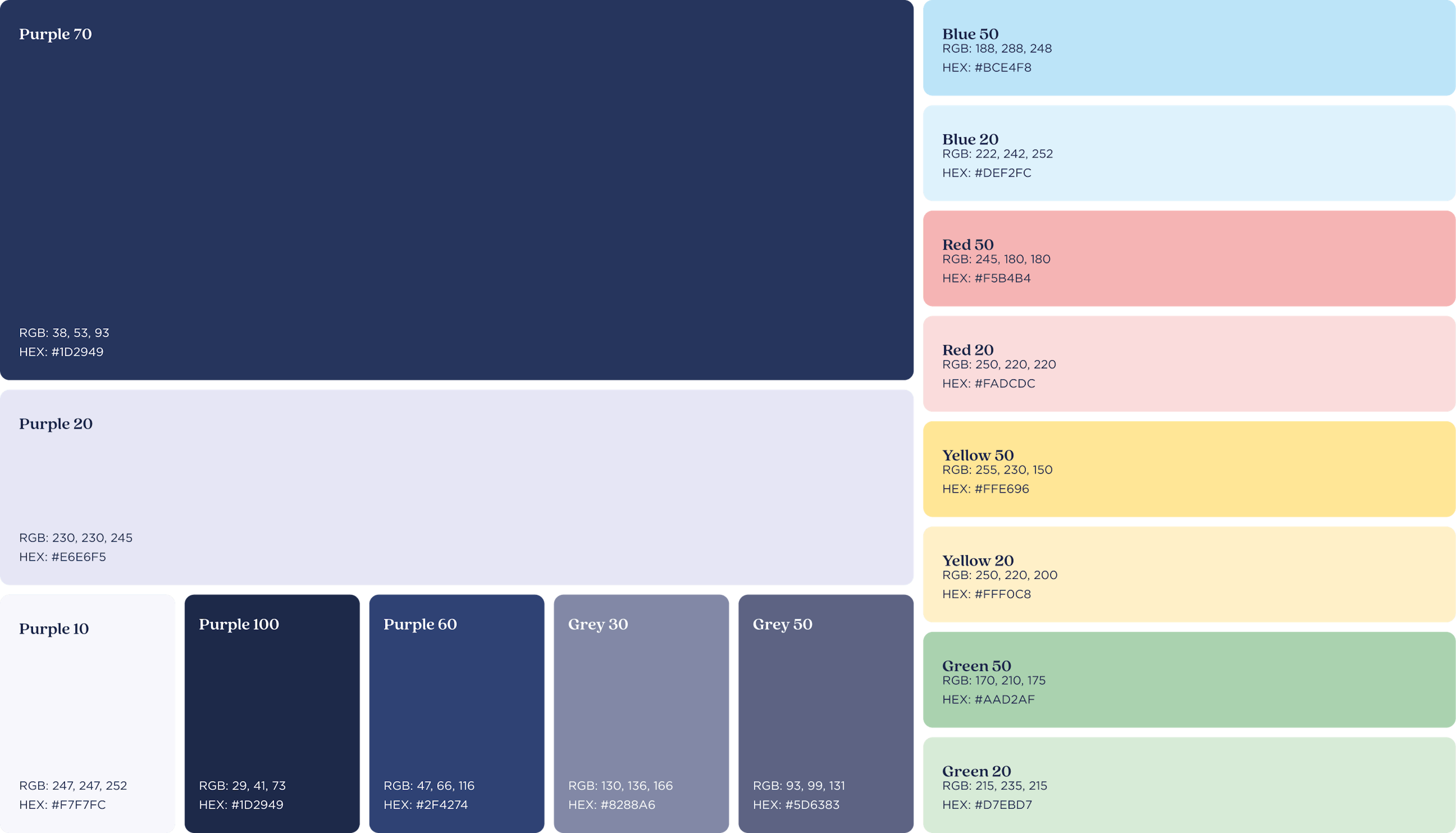
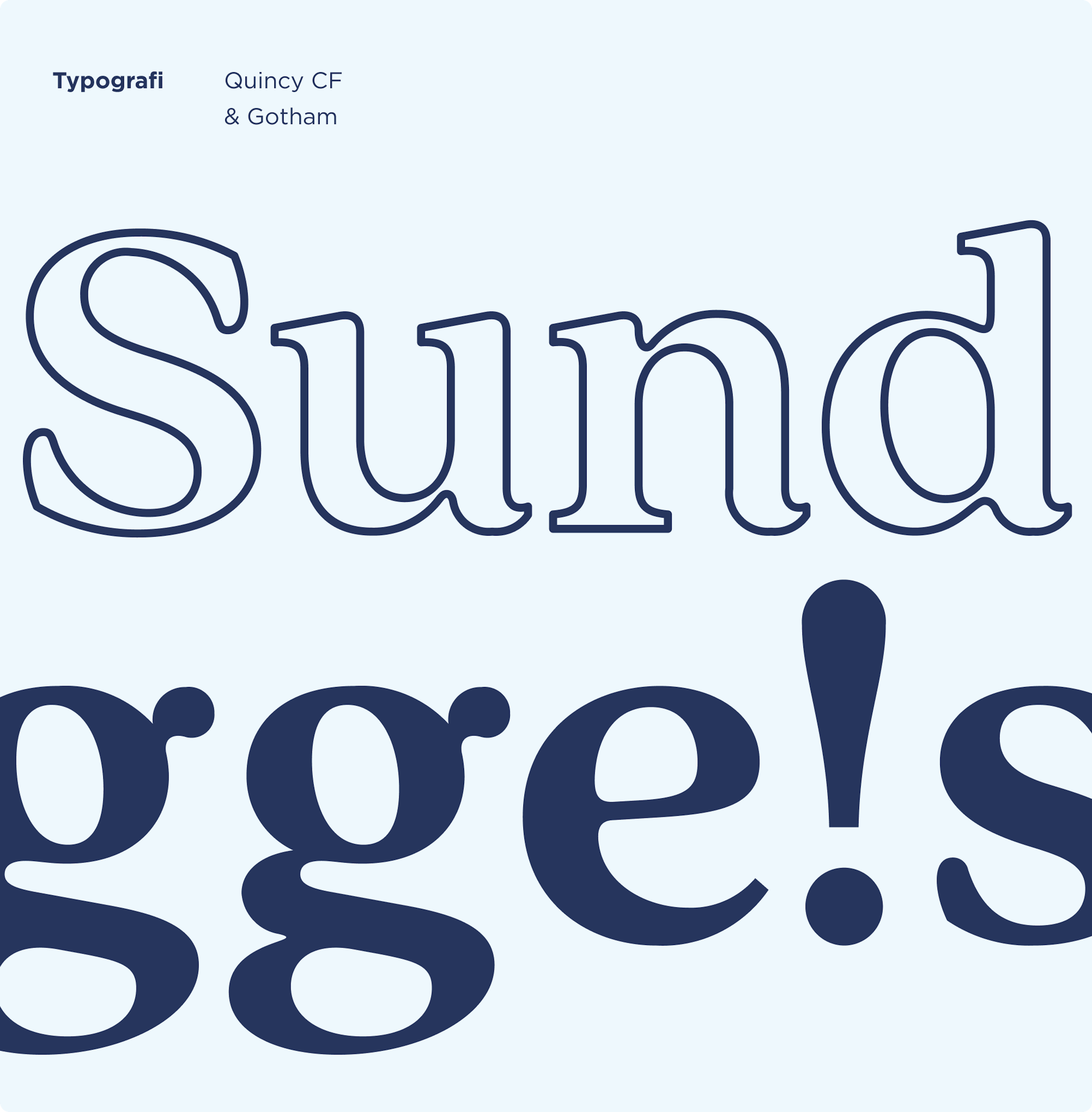
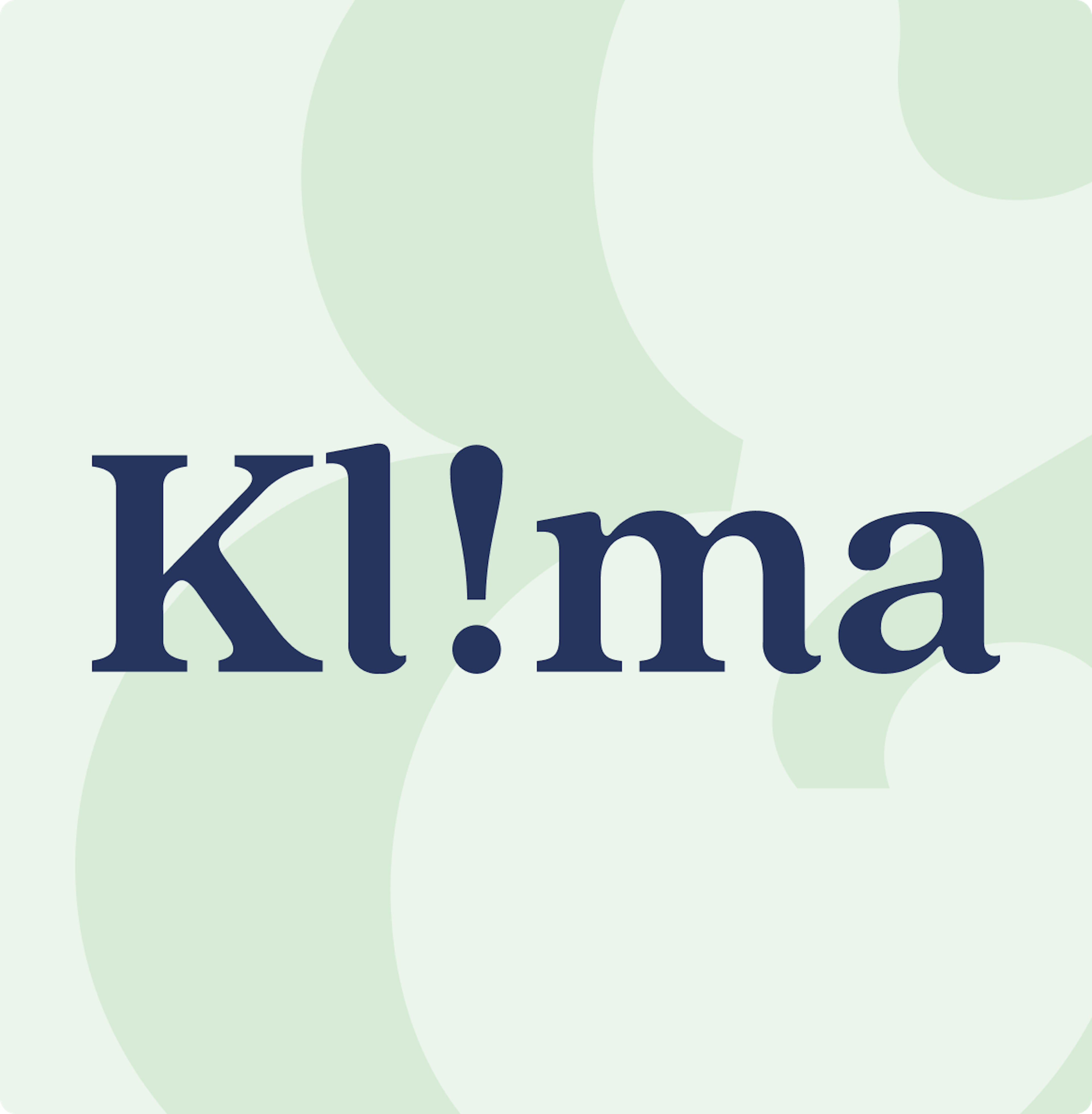
Based on F&P's new visual identity, Charlie Tango designed a digital experience that appears elegant and simple and makes the large amounts of, sometimes heavy, information manageable, easily accessible and inviting to the user.
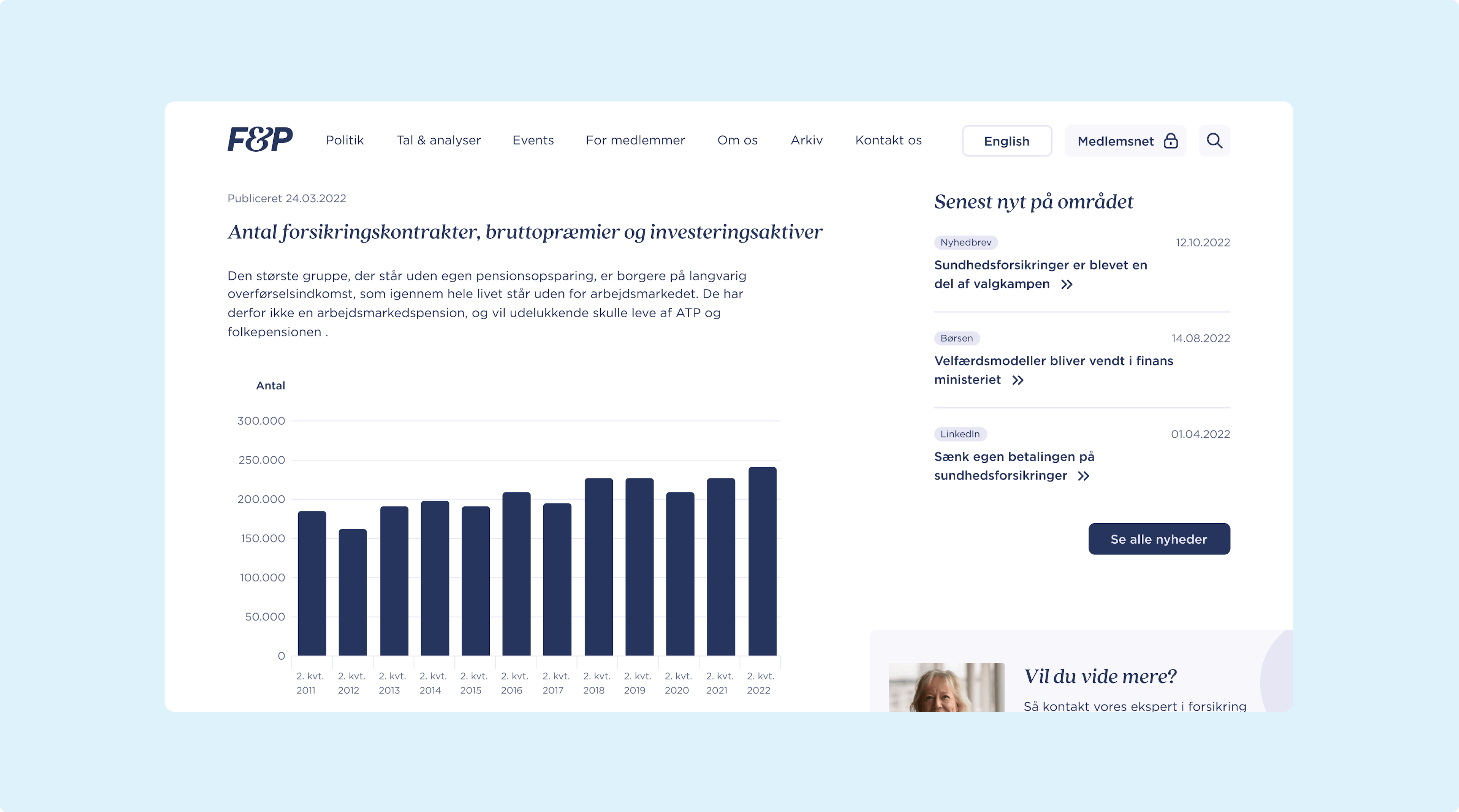
User-centered information
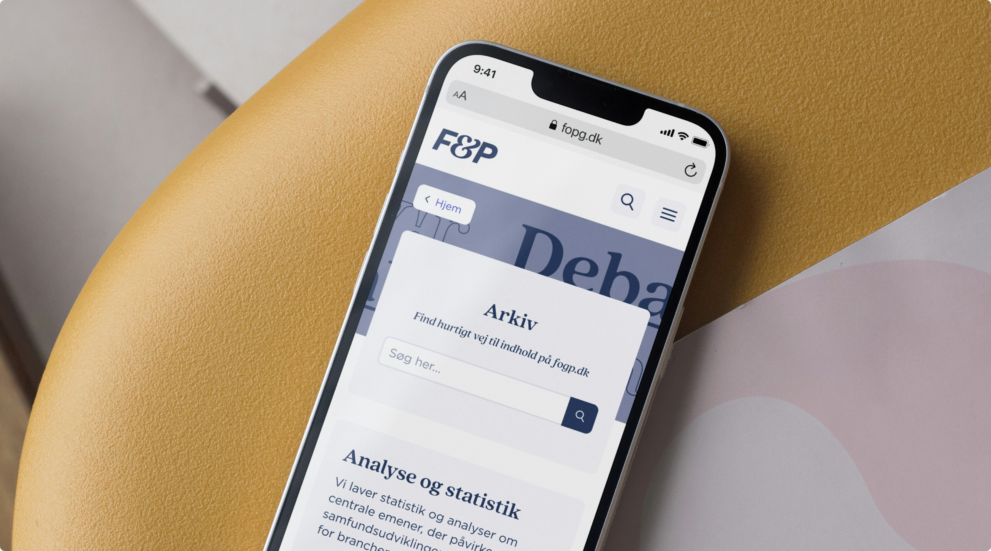
The website must answer the questions of the various target groups and bring F&P's extensive knowledge and areas of interest into play. This is done with a combination of simple, user-centred and updated information pages, links to other relevant knowledge and easy opportunities for dialogue with the relevant knowledge workers.
