Diversa
Experts in digital accessibility
Diversa is a front-runner when it comes to both education and consulting on digital accessibility. From their many years of working in the field, and personal experience with the difficulties one can meet when navigating the digital world, Diversa has built up a unique know-how. It’s their vision that everyone should be able to act digitally if they want to. Because digital accessibility creates personal freedom, and the ability to actively partake in society. With a playful take on accessibility, based on the fact that we see the world we live in differently, we have created a new website and visual identity for Diversa.
diversa.dk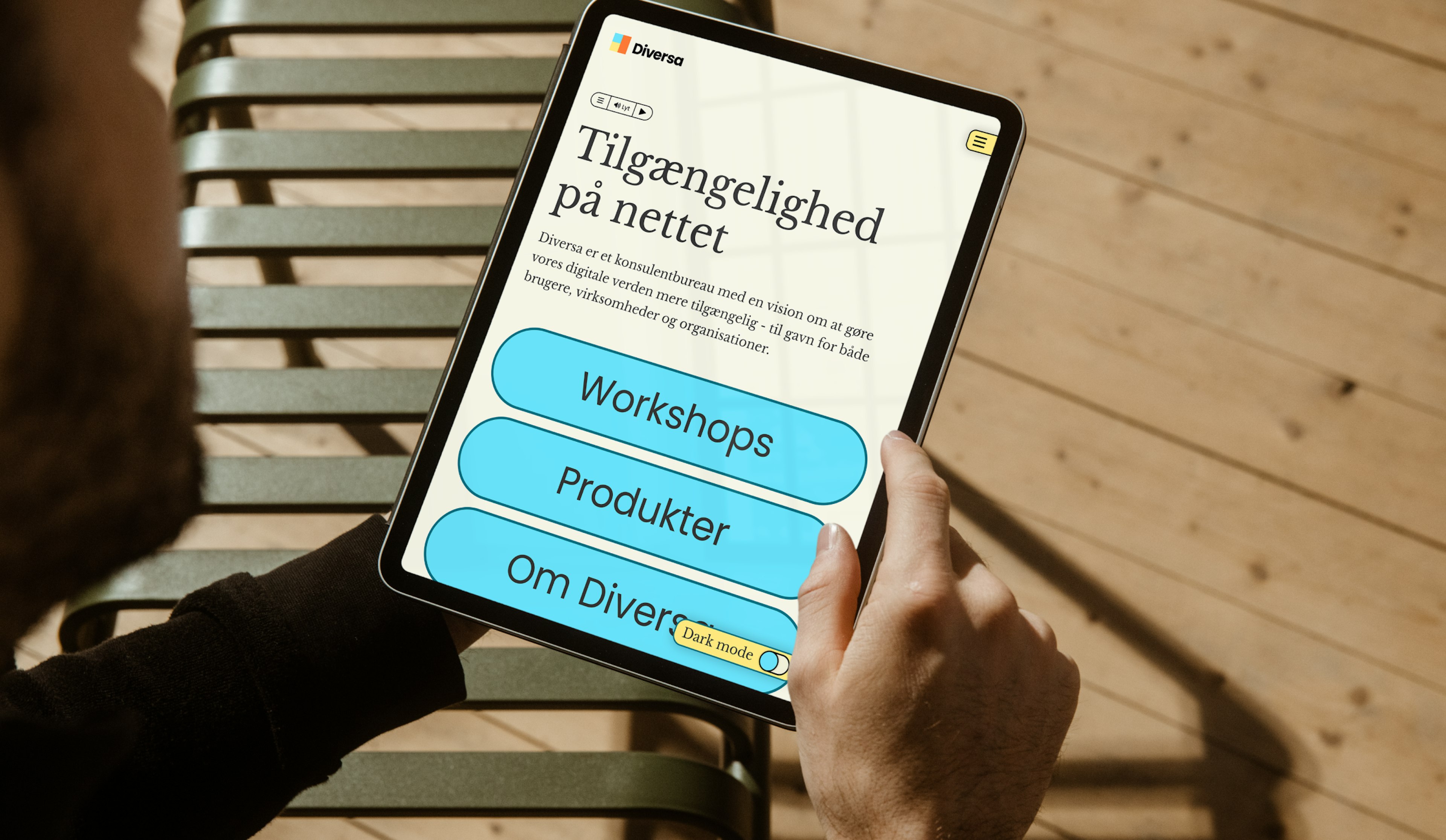
With accessibility as a starting point
Diversa was curious about developing their visual identity and digital platform to better reflect their approach to accessibility. An approach that engages designers, developers, and users in a playful and educational manner. With this as a starting point, we began exploring fundamental design elements such as color, typography, and scale.
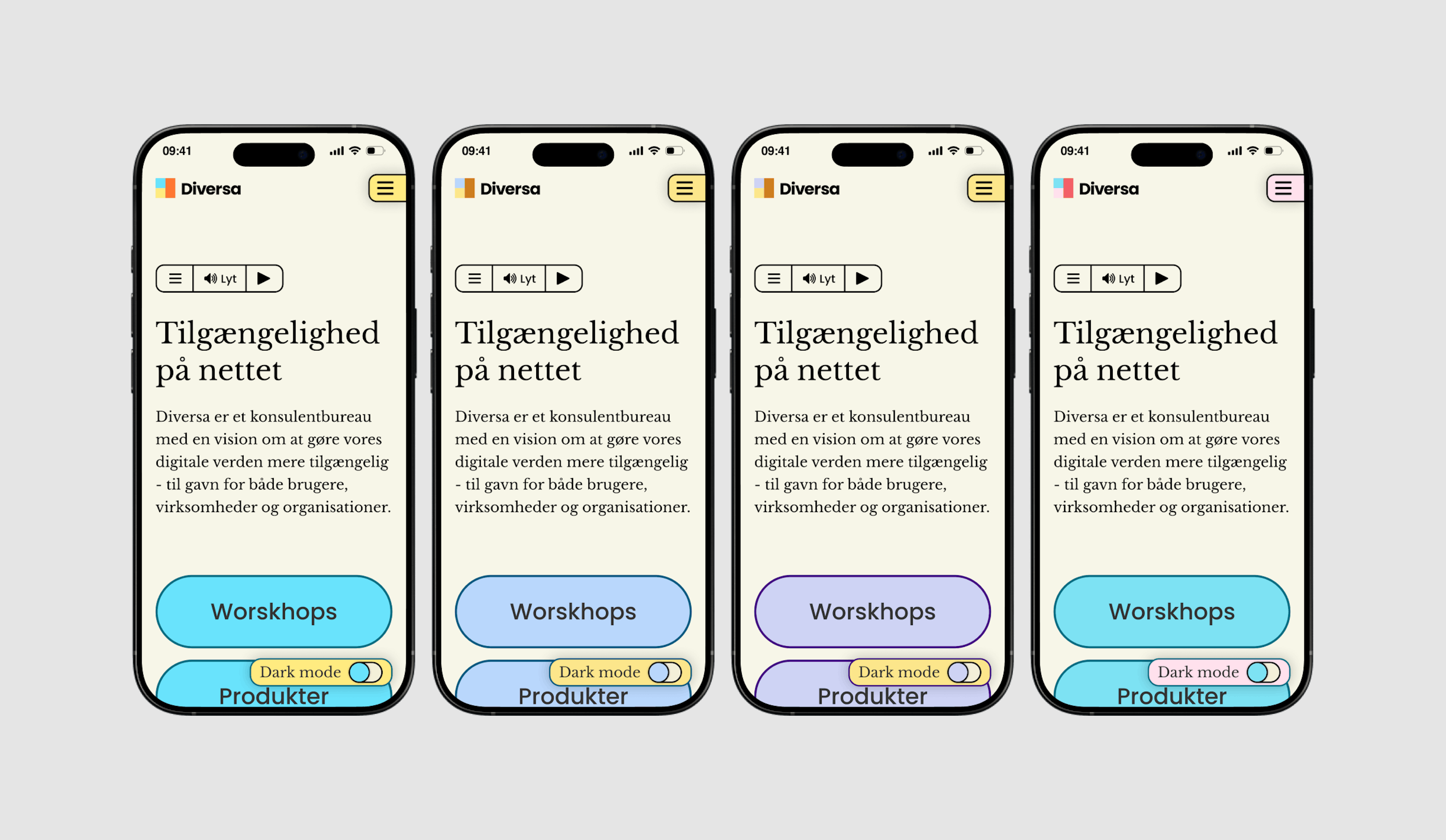
After conducting research on different ways of perceiving colors, we were drawn to the idea of creating a color palette that ensures contrast—regardless of whether someone has normal vision, deuteranomaly, protanopia, or tritanopia. This idea ultimately became the foundation for Diversa's new digital platform and visual identity.
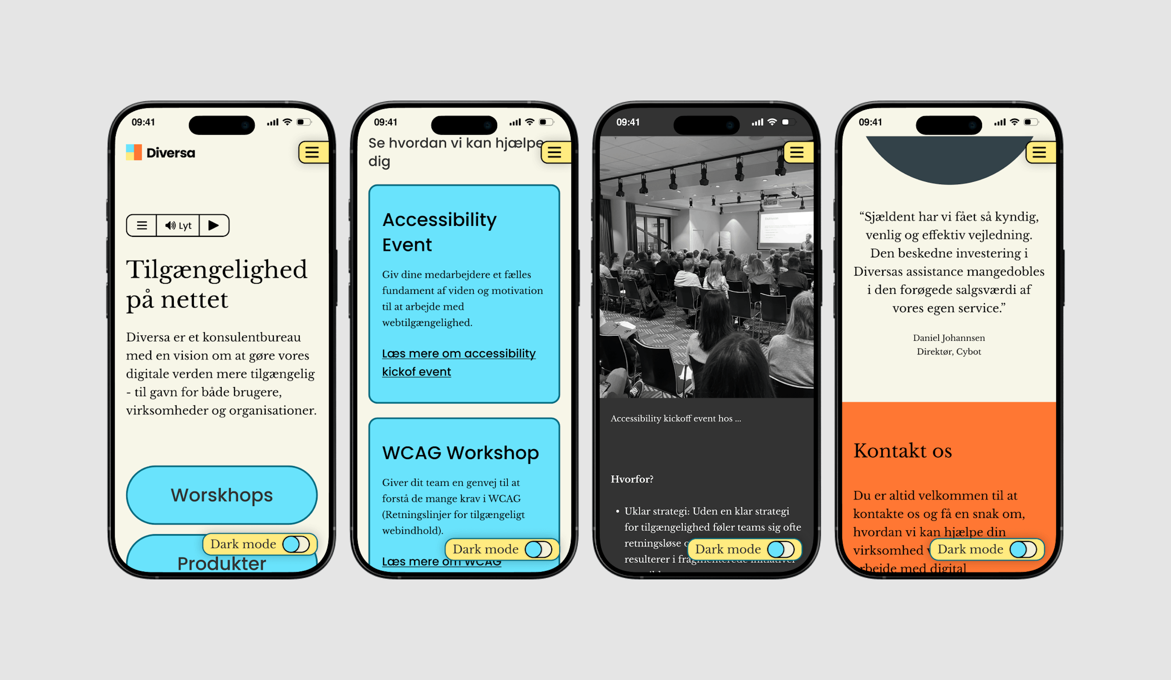
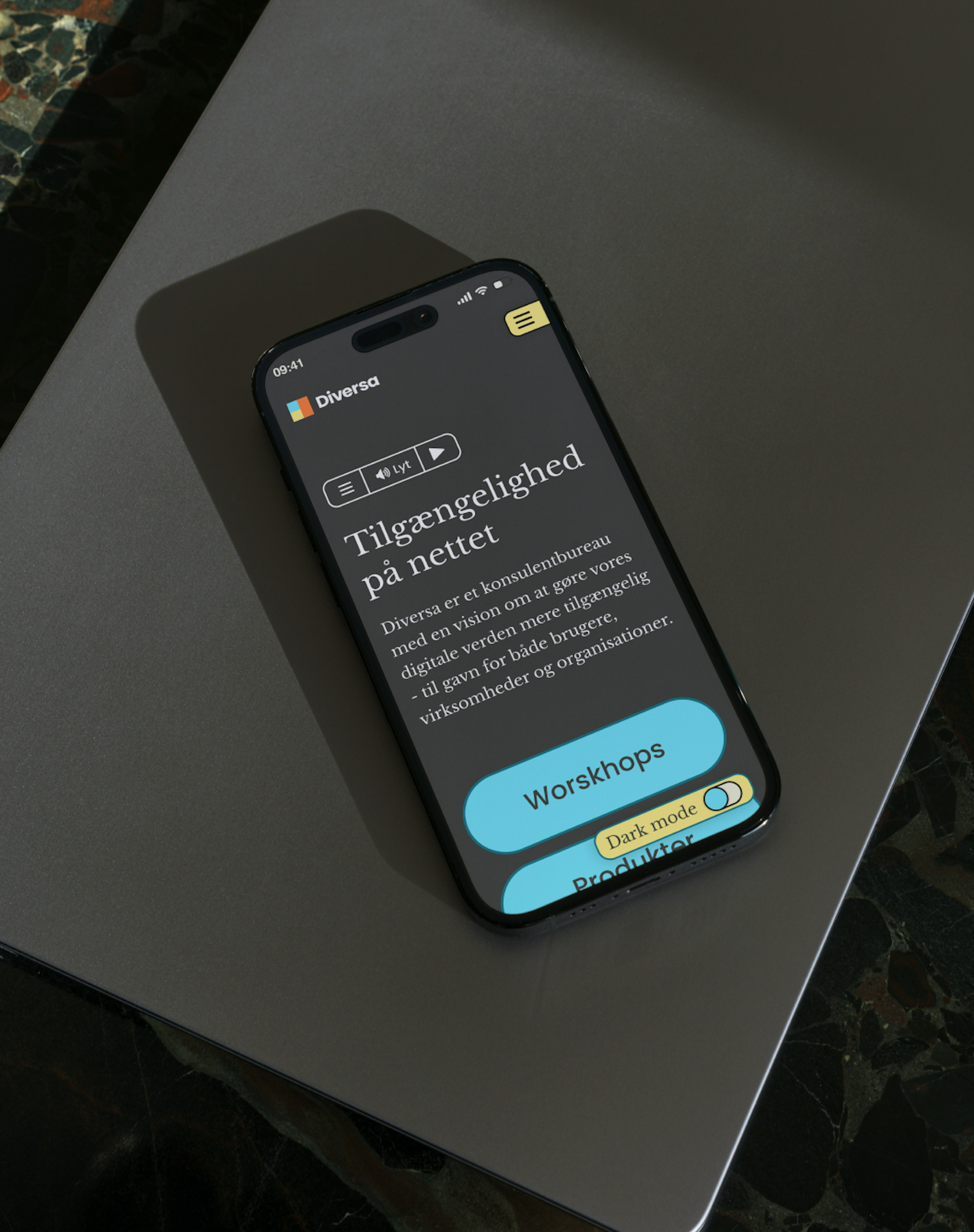
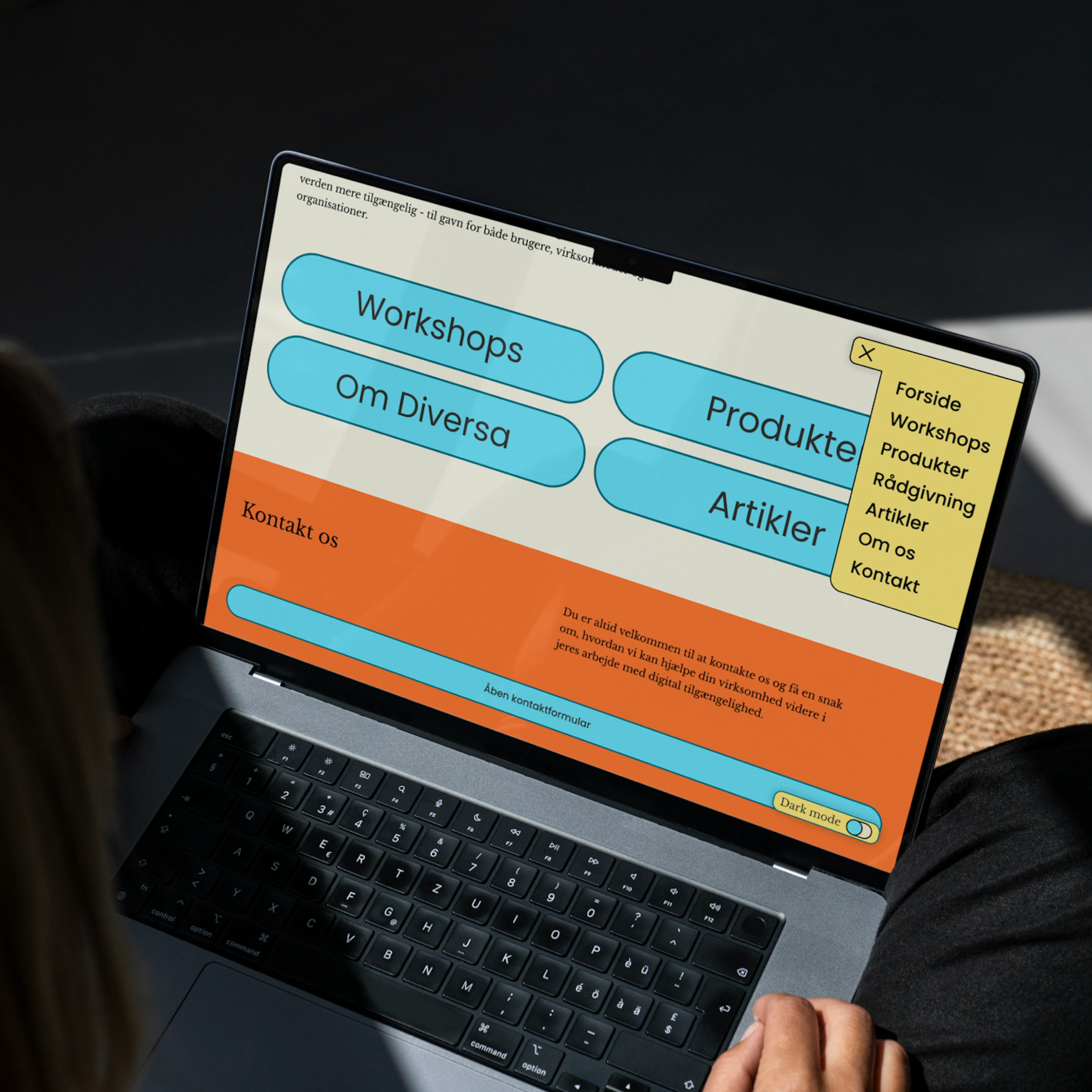
Mobile vs. Desktop
With playfulness at the heart of our design approach we aimed to create an almost childlike design, with big text and buttons and strong contrasting colors. Simply stacking on mobile devices.
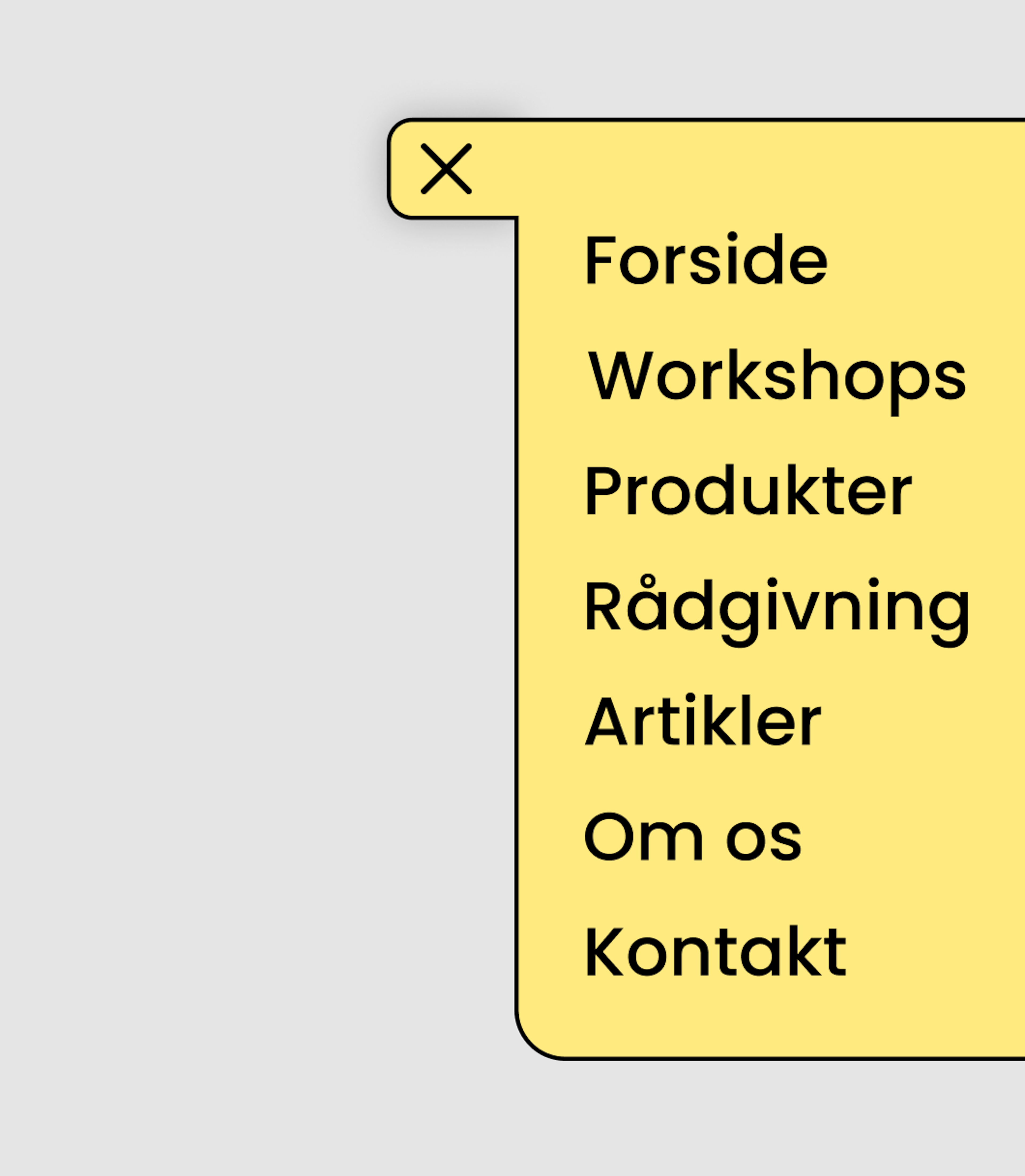
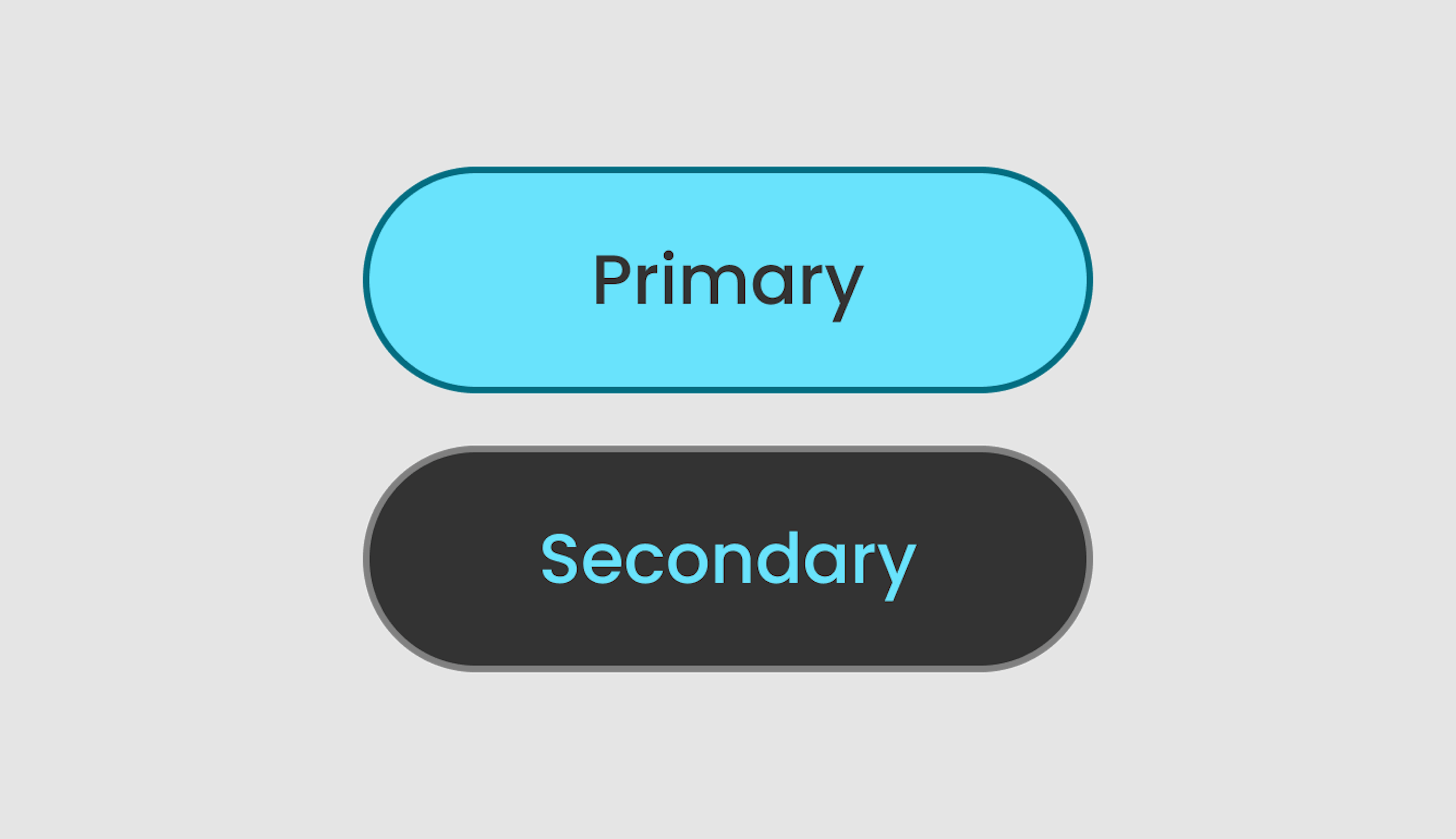
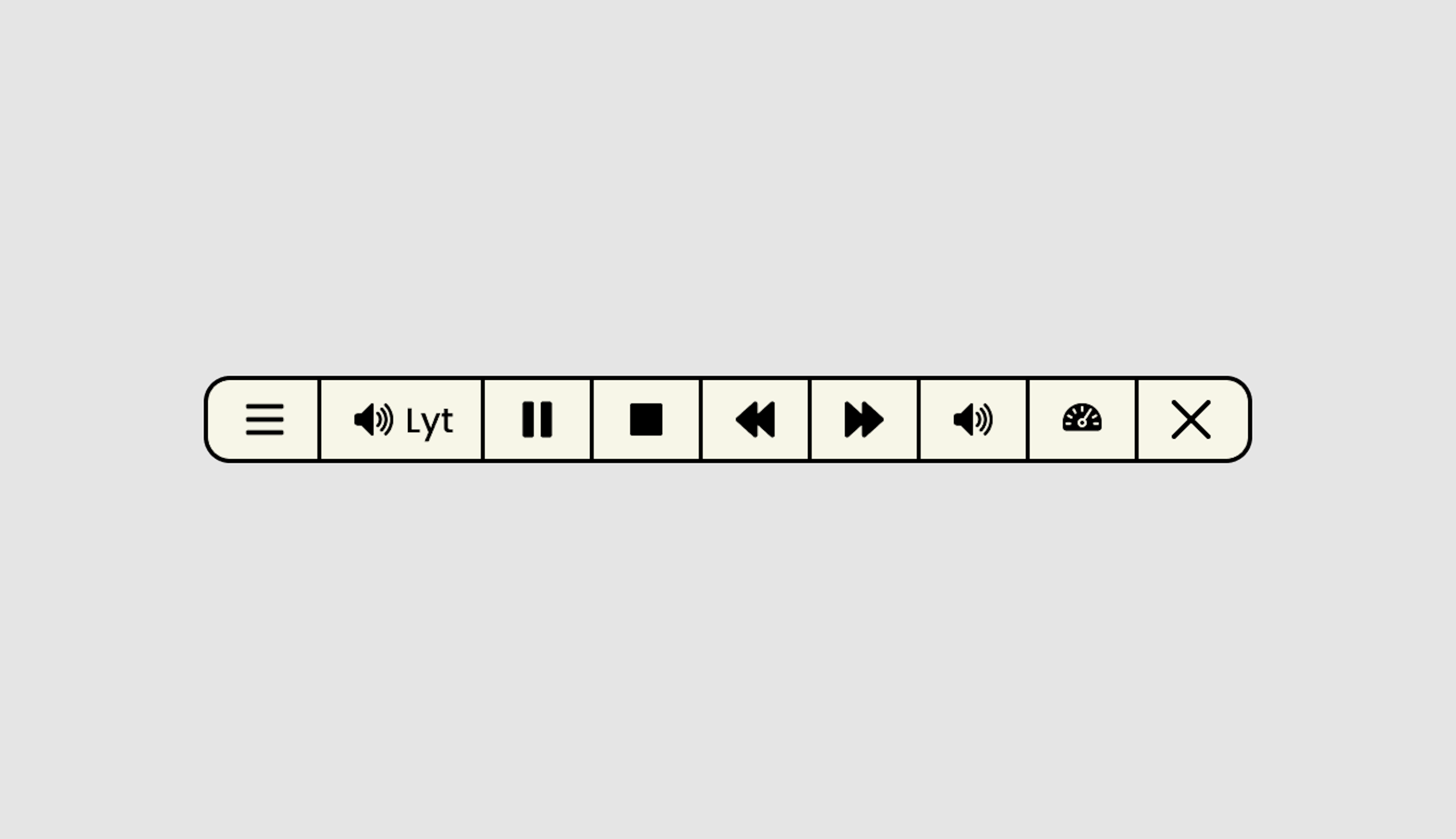
Design elements and components
Buttons and interactive elements were design with the intention to push the overall message, and backbone of our brief that accessibility is something creative and fun to interact with, and learn about. A confrontation with accessible design as something boring and limiting.

Intentional dynamism in staticness
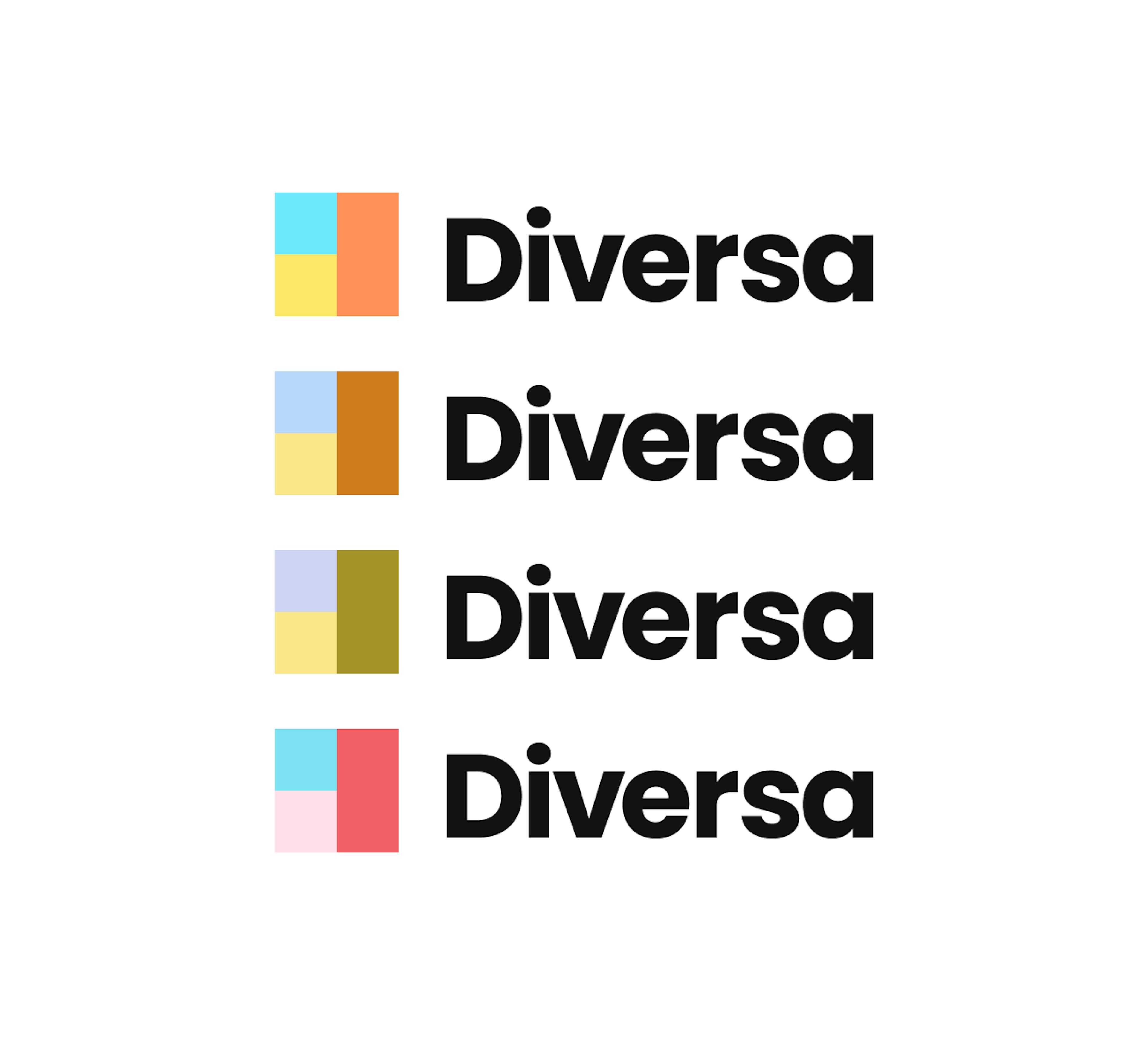
The new logo was born out of the iterative process of working with the overall visual identity, and having ongoing discussions with the client about color and contrast. An abstraction of the fact that we see the world differently.

Concept for re-launch
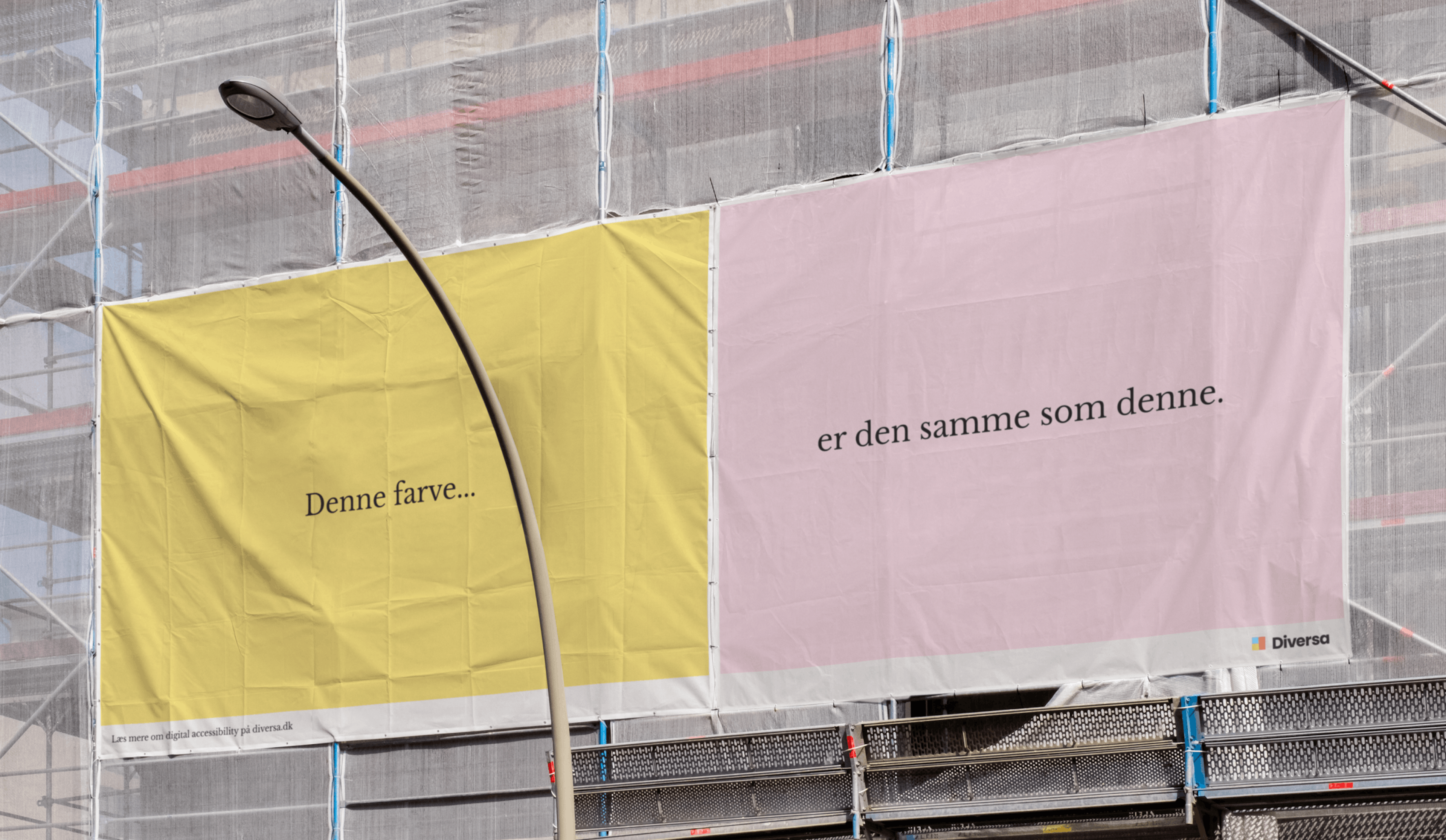
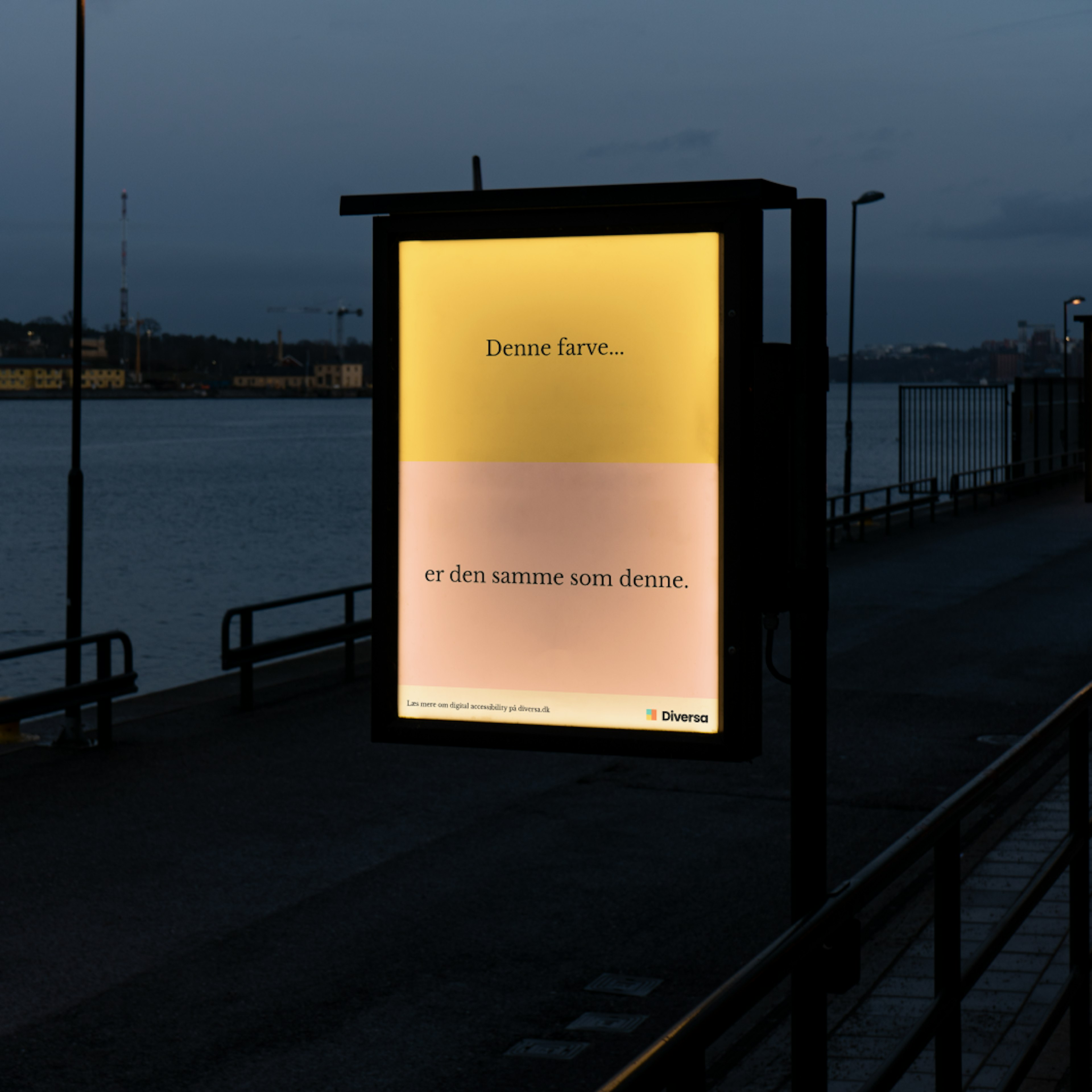
In relation to the launch of Diversa’s new identity we conceptualized ideas for a campaign that would play on the fact that we see the world differently, along with merch such as tote bags that will be designed in a more abstract and graphic manner.
