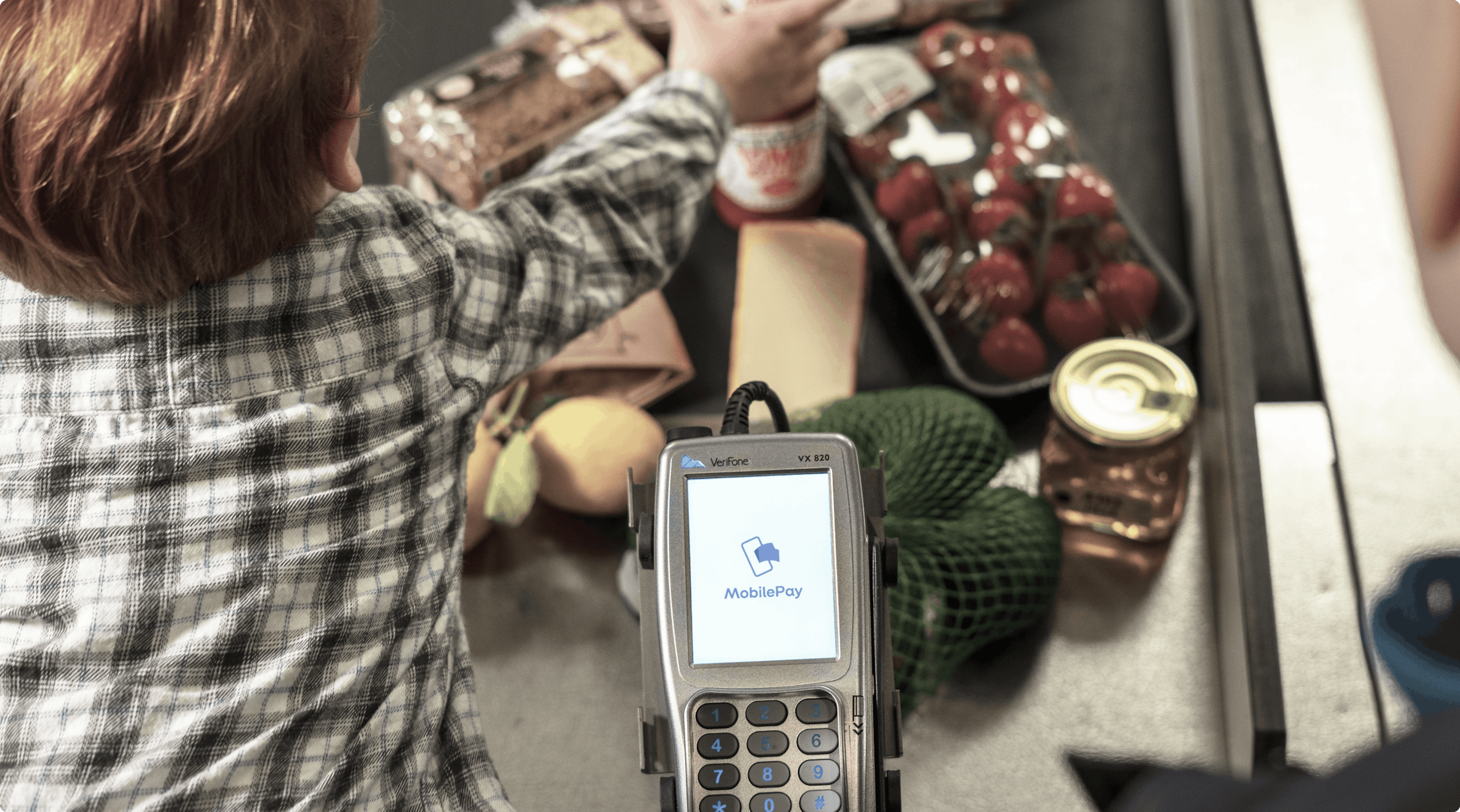
MobilePay
Most downloaded and used app in Denmark
Danske Bank is one of the largest banks in Denmark. They have been around for more than 150 years and are a well-known player in the Danish private and business economy. They strive to be a driving force for growth and development in society, and have evolved along with society and helped shape the development. Not least digitally and thus also in terms of mobile payment. With our vast experience in creating apps, we were asked to help with the development of the basic concept and first version of what became known as MobilePay.
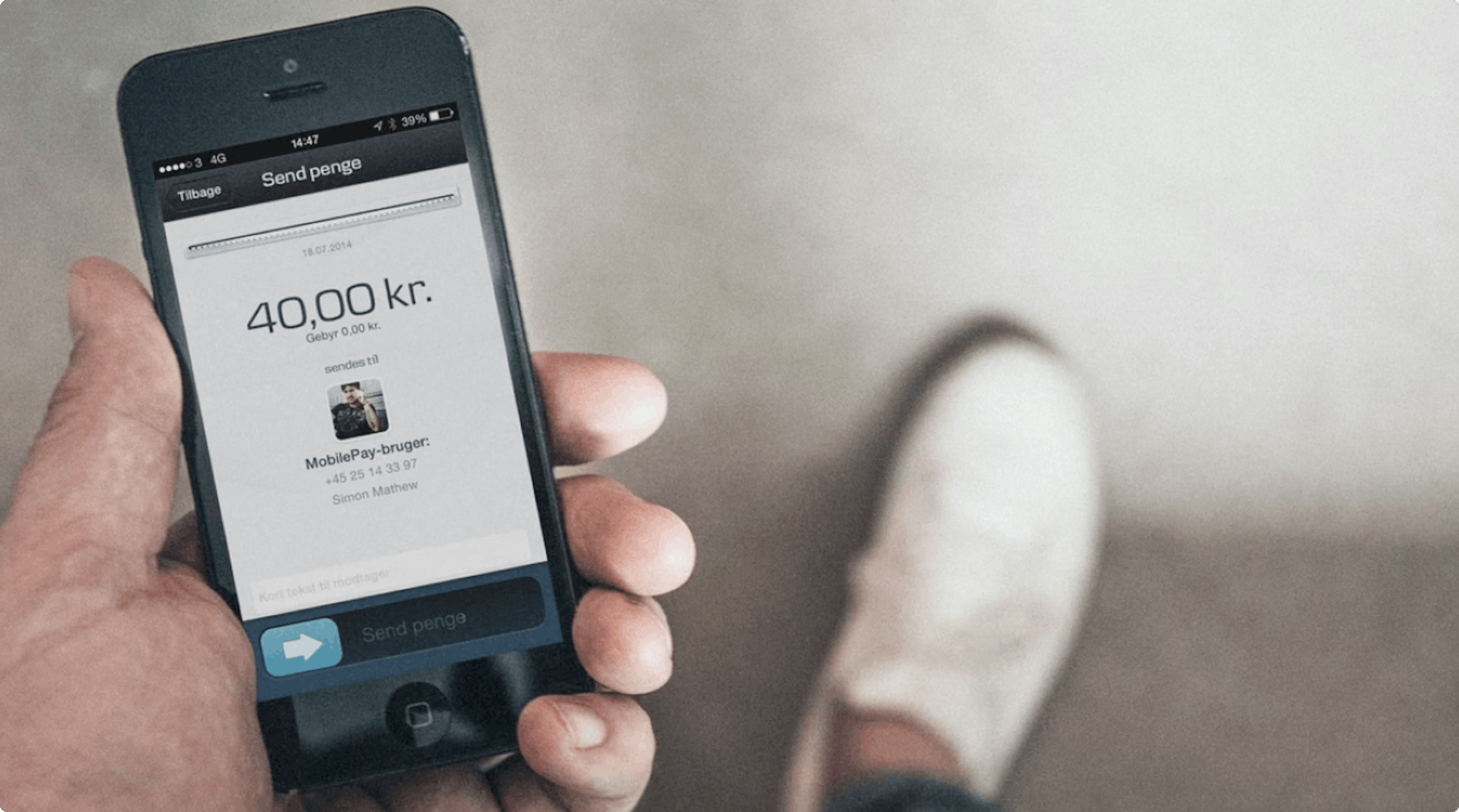
Being the first with a mobile money transfer app
The idea of a payment app like this was groundbreaking and there were virtually no solutions to compare it to. One requirement was that using the app had to be as easy as using cash. Danske Bank approached the project with a very open and ambitious mindset, which is among the main reasons why the project was so successful: they let the user journey dictate every decision made and were willing to sacrifice at every point to create the best possible user experience
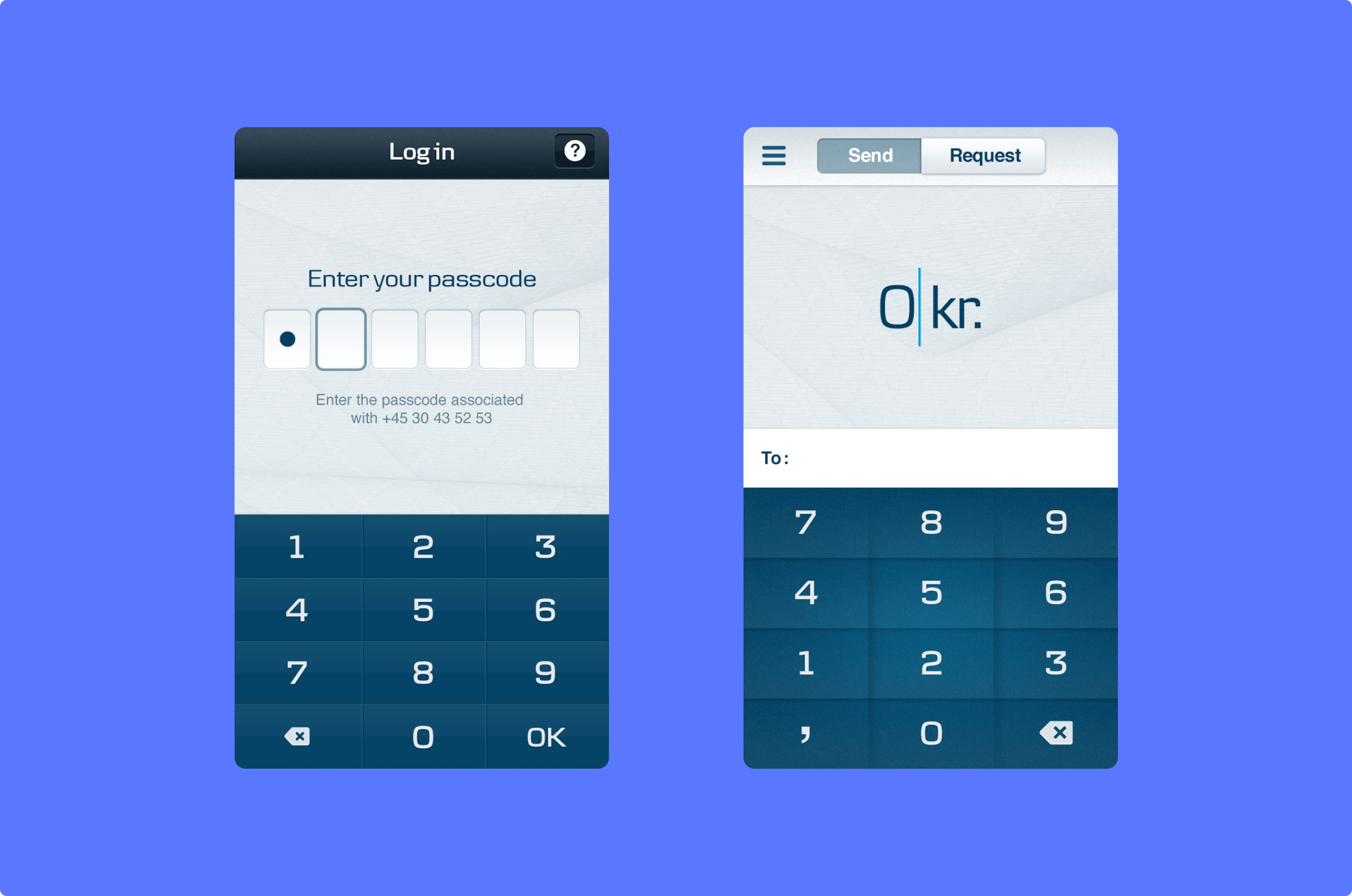
A simple app that fulfils a new need in the population
As cash was being phased out, MobilePay responded to a need in the population to easily transfer money to each other. But it's the simplicity and convenience that makes the app stand out from other banking apps. In close collaboration with Danske Bank, Charlie Tango's design team reduced the user journey and interface to an absolute minimum. Screen touches to complete a payment were counted and deducted. The user interface design also stood out from traditional transfer platforms with its playful yet elegant and trustworthy design. A major focus to ensure an attractive and convincing user experience.
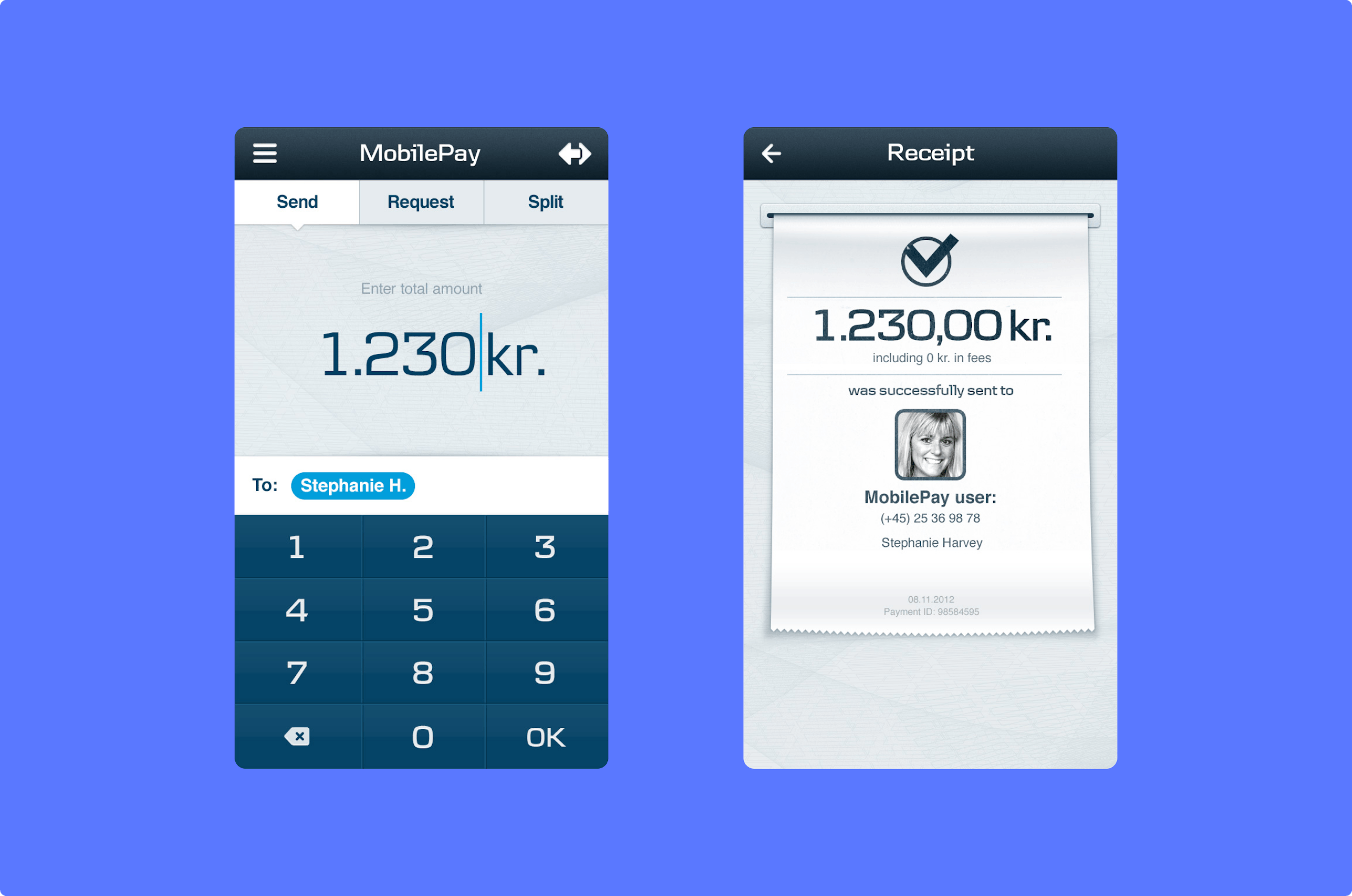
The core functionality has been preserved since launch
Today, MobilePay has over 4 million users and around 200,000 stores. The core functionality is the same as when it was born in 2013, including the linking of account number and phone number, making it easy to transfer money to your contacts - as easy as using cash. The swipe function has also been retained as it was back then. Design-wise and technically, this function utilised an option that the app's user interface offered, but which had not yet been exploited in a payment context.
