MobilePay turns 10 years old
With more than 5.8 million users, MobilePay has been downloaded on 90% of all smartphones in Denmark, exceeding all expectations since the app was launched back in 2013. We started designing the app about two years into a really close and good collaboration with Danske Bank, where we were busy designing a wide range of solutions, both for the bank's customers but also for internal systems in the bank.

One day, our current CSO, Rasmus Sanko, received a call from the talented business developers at Danske Bank describing the framework for the app we now call MobilePay. Rasmus' immediate reaction was pure panic - the idea was almost unthinkable at the time - and there were virtually no benchmarks to compare it to.
The task was to create a concept, a design, for an app that could instantly send money between individuals using only their phone numbers. Most importantly, the solution had to be "as easy as cash."
It seemed like an impossible task - we were honestly quite doubtful that we would succeed. This doubt made us think twice, but it's also the reason why today we have a payment app with instant transactions, intuitive design and no user fees.
The positioning of MobilePay played a big role in the design process. Banking apps already existed, so being able to transfer money from a smartphone wasn't a novelty in itself. It was the simplicity and convenience that MobilePay needed to stand out. Therefore, the first step in the process was to remove all unnecessary noise from the user journey.

The process started by counting the minimum number of screen touches the user had to make to complete a bank transfer in Danske Bank's own banking app. We counted a whopping 19 touches.
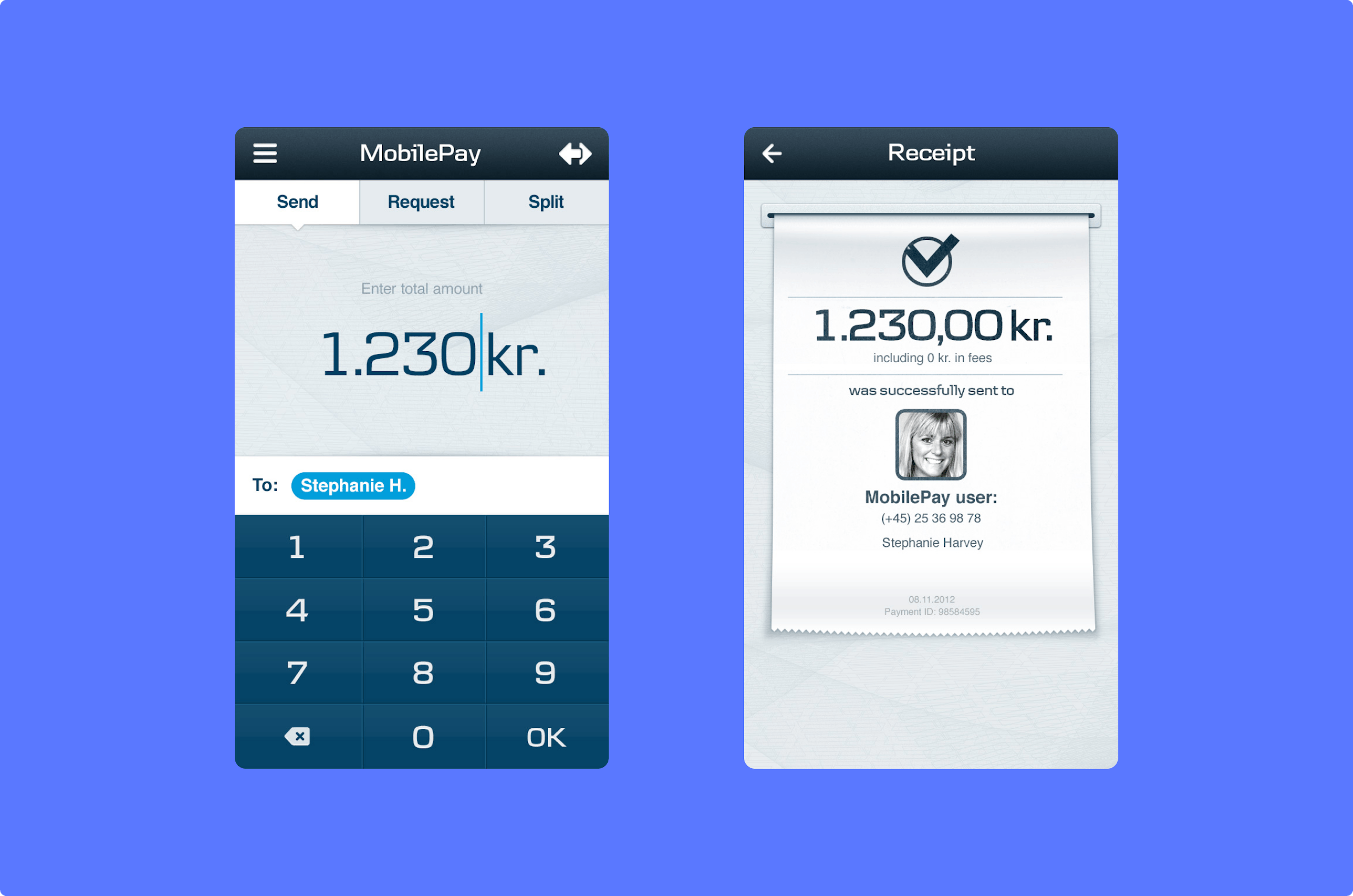
Our goal was therefore quite simply to reduce the number of touches as much as possible to achieve the fastest and easiest form of mobile payment method on the market. And it's fair to say we did just that. 7 touches from opening the app to transferring the money. That's what the original MobilePay app had to offer. The user journey and interface were cut to the bone and the criteria for a fast and convenient transfer could be ticked off.
The app revolutionised bank transfers in several ways - not just from a practical perspective. It made transferring money almost fun! The design stood out from traditional transfer platforms; it was playful, yet simple and elegant.

Looking back on the MobilePay project, which has just turned 10 years old, it's with pride and gratitude. But most importantly, we look back without wishing we had done it differently. The core features that we're all familiar with have remained the same to this day, and that's almost the realisation that we're most proud of.
That said, the key to the project's success was Danske Bank's skilful, ambitious and open approach. They let the user experience dictate every decision made and were willing to sacrifice on key points to make it as simple as possible. This freedom and open approach provided the framework for our dream project - and for that, we're incredibly grateful.
Join the MobilePay celebration and send some money! It's as easy as pie.
